Commercial Surfaces: Why Microcement is The Next Big Thing
From Retail to Healthcare, microcement is a part of some incredible interior designs in commercial spaces. Let’s explore why, and have a look at some of our favourite commercial microcement projects from around the world.
From eateries to award-winning retail architecture; microcement is becoming increasingly popular for commercial interiors worldwide.
Known for its versatility, microcement can be applied to a variety of surfaces, including floors, walls, and joinery. Its unmatched durability and seamless finish create cohesive and visually appealing environments that meet the demands of high-traffic areas.
There are several reasons why interior designers and architects are specifying microcement in commercial spaces; the ease of maintenance and ability to withstand heavy foot traffic to name a few. Our product X-Bond has been used all across Australia (as well as the United States and Europe).
Beyond its practical benefits, microcement offers creative flexibility for fans of the minimalist concrete-inspired aesthetic. Clients can choose custom colours and textures to meet the specific needs of their brand or establishment. This versatility, combined with its functional advantages, positions microcement as a leading material choice for floors, walls, and joinery in the evolving landscape of commercial interior design.
Aesop Francs Bourgeois, Paris
Aesop stores are known for their unique designs that take cues from the city they reside in. The Paris store is no exception, with a winding the layout based off the nearby Place des Vosges (one of Paris’s oldest city squares).
This meticulously crafted environment takes on an otherworldly quality. The entire room feels hand-carved, a feeling enhanced by chalky plaster on the walls. It technically isn’t microcement, but looks exactly the same — even down to the raw hand-finished texture.
Haight Fashion Store, Rio de Janeiro
It might look like this Brazilian swimwear brand lives in a cave, but that’s all thanks to a really clever use of sculptural, organic elements. Textured microcement walls, plenty of curves, and all different stone types come together to transport visitors to the kind of exotic places they might expect to wear one of Haight’s designs. It’s luxurious, minimalist, and sculptural — just like the swimwear it houses.
Viktoria & Woods, Melbourne
Where refined elegance meets contemporary minimalism, upscale but un-pretentious; the Vik + Woods store reflects the brand’s design ethos; simplicity made striking. X-Bond Microcement flooring in the colour Umber carries the designer’s signature neutral palette. And, thanks to the hand-trowelled application, they look soft as the merino wool sweaters lining the racks above. More on this retail project.
Headcase Hair, Sydney
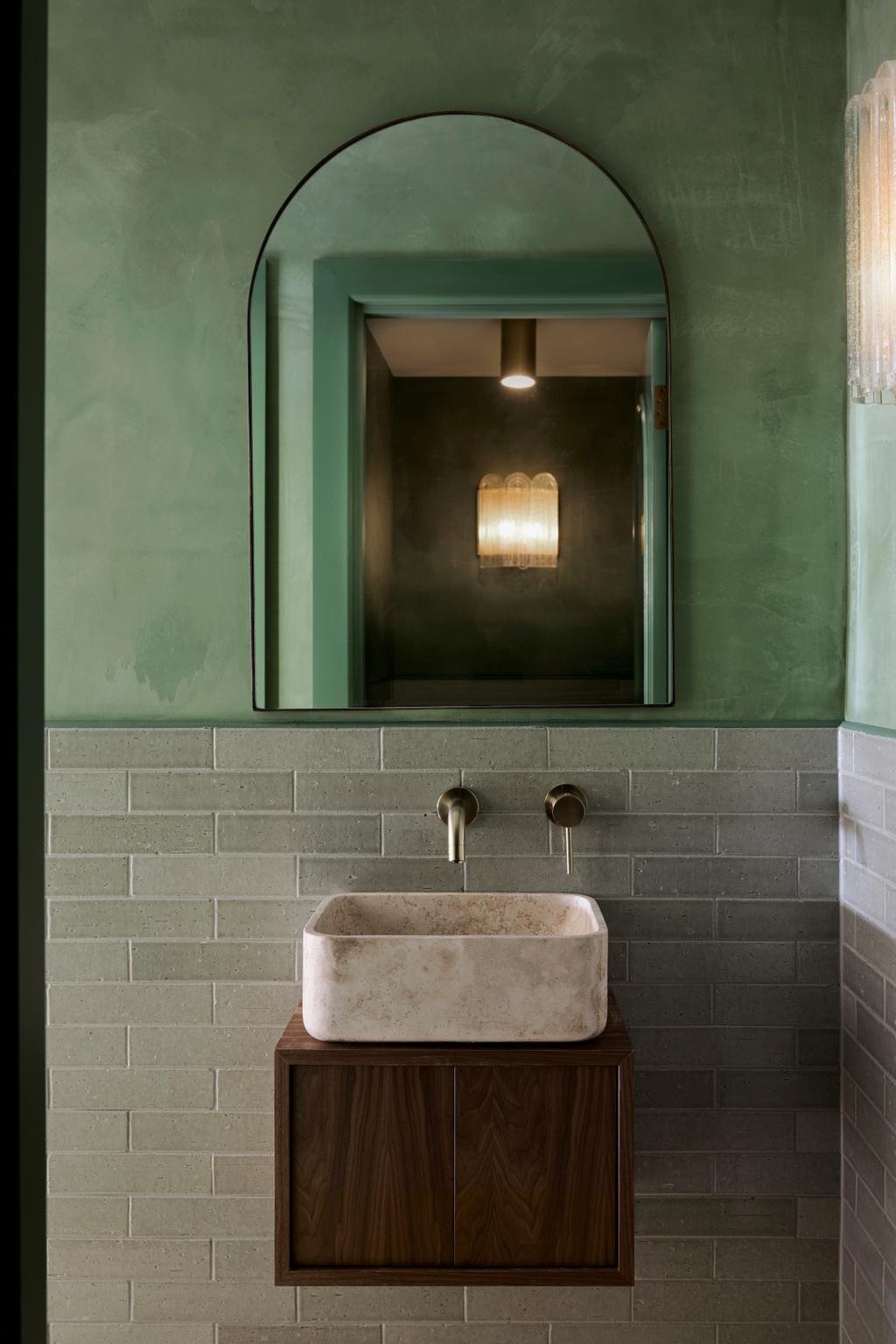
Named by Vogue Living as Sydney’s prettiest hair salon, Headcase Hair balances a serene spa-like ambiance with plenty of colour. Engaging without being too loud, the walls contrast a vibrant statement green with a softer, neutral blush. If you choose a product like X-Bond, you too can achieve custom-coloured perfection.
Ode Eatery, Kuwait
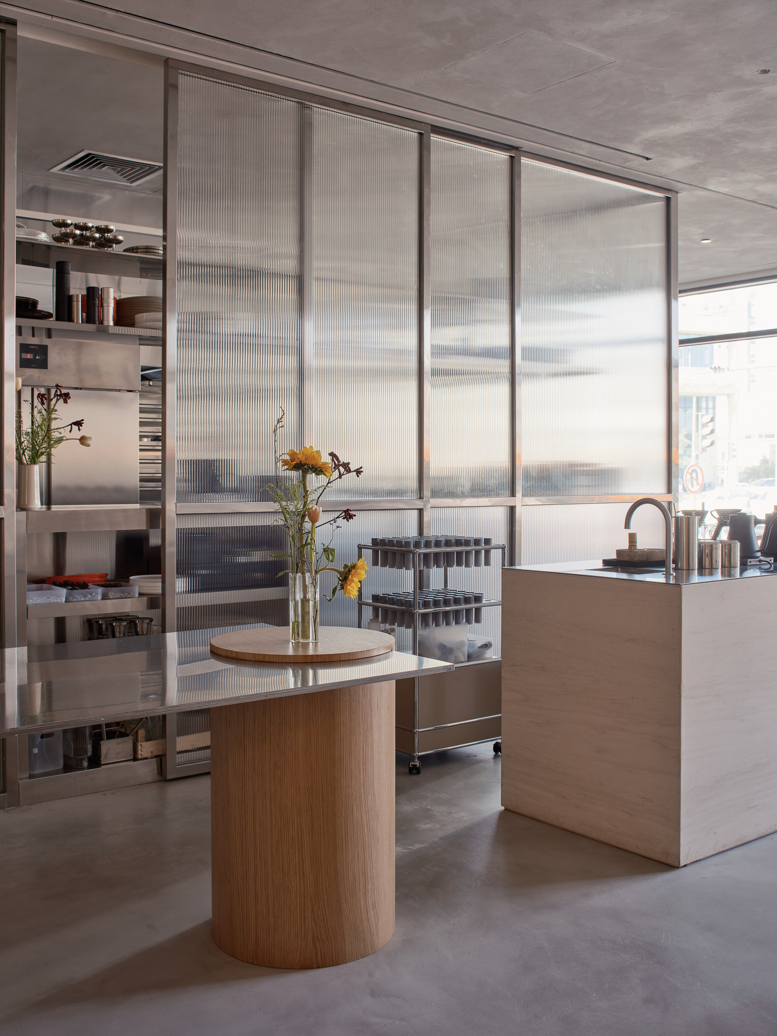
This design meets all the functional needs of an eatery, yet feels a lot like a contemporary home thanks to the furnishings and materials selections. The result is an atmosphere that’s equal parts industrial and indulgent, allowing both customers and the staff to do their thing.
It’s also the best advertisement for microcement flooring in hospitality, where the maintenance demands exceed that of a residential project. A mix of contemporary and vintage furniture helps curate this minimal yet highly textured environment.
Living Bakkali, Valencia
Adobe architecture is characterised by earthen building materials — adobe being Spanish for mudbrick. At Living Bakkali, a distinctly adobe-inspired design, microcement is used to replicate the organic qualities of traditional adobe structures.
On walls, floors, and ceilings, the seamless curved surfaces are part of a bold monochromatic colour story, a modern reflection of Spanish tradition.
Be Kids Therapy, Melbourne
Selzer’s design for this children’s psychology clinic forgoes traditional clinical aesthetics — even earning a feature in The Local Project. Calm, neutral, and child-friendly were the criteria for this multi-disciplinary space — with X-Bond Microcement flooring contributing to a gentle, soothing environment. Pale tones, lots of natural light, and soft earthy-coloured furniture are also important.
A lack of sharp corners, replaced instead with curving walls and joinery, has a softening effect that’s necessary in such sparsely decorated environments. Too much clutter and it can be overwhelming for clientele, but without enough sensorial and visual engagement it would feel spartan and unwelcoming.


