Neutral interiors aren't going anywhere, but we're seeing a growing appetite for unexpected combinations that bring a little more personality into residential spaces. Here are five colour pairings we're drawn to right now.
1. Olive Green & Maroon
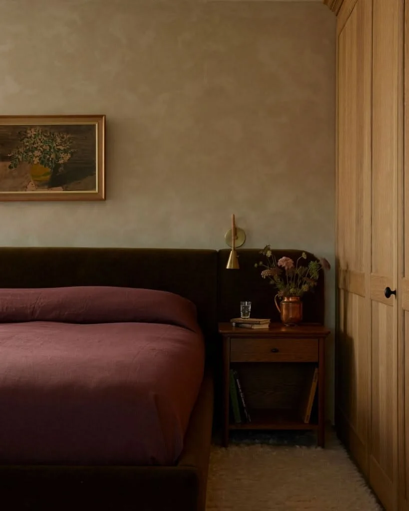
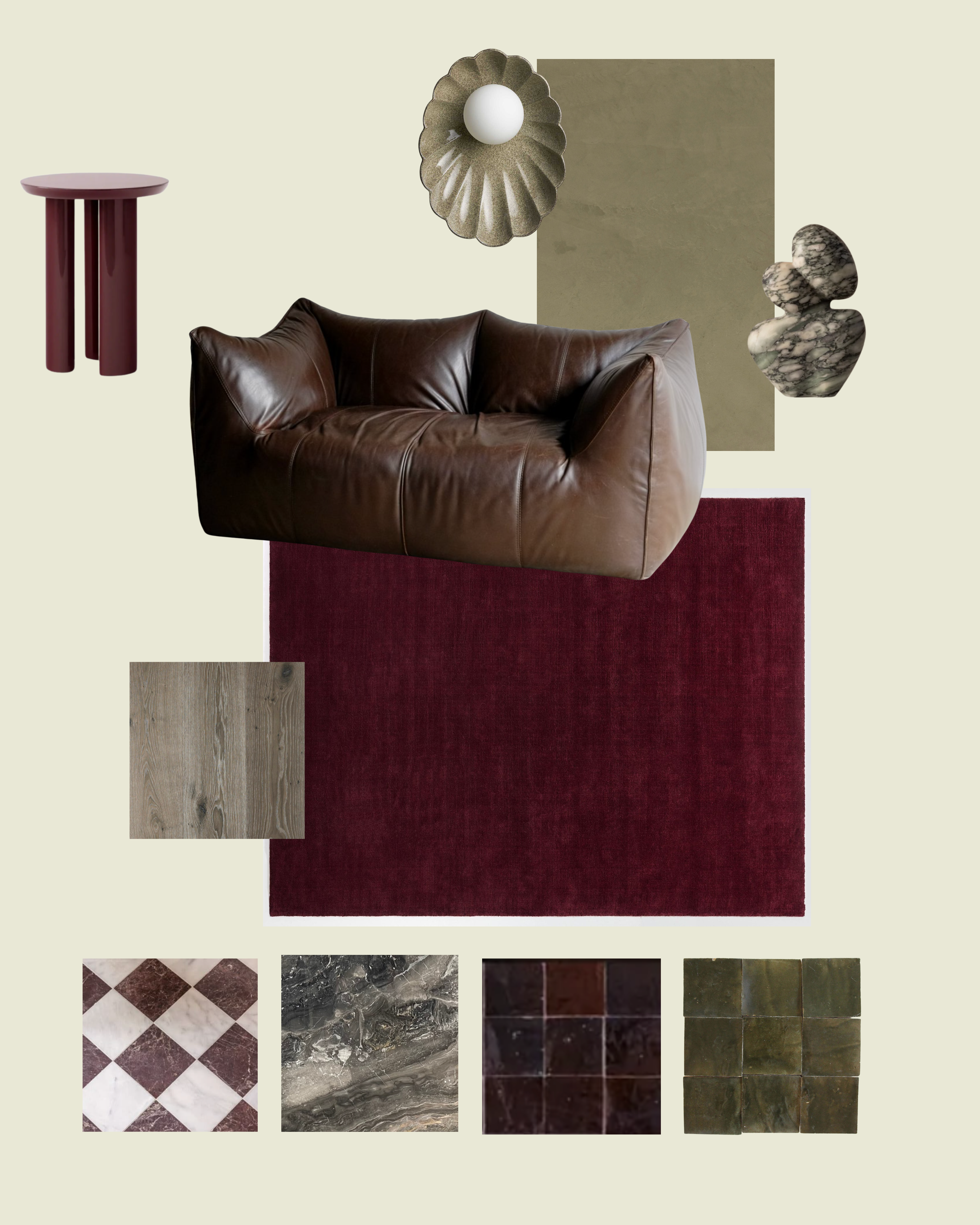
Green and red might sound like an unlikely pairing outside of Christmas, but choosing deeper and more muted shades gives this combination an entirely different effect — one that doesn’t bring to mind sleigh bells. Olive green has an organic, earthy quality that works beautifully against the richness of maroon or burgundy. The contrast is noticeable without being overwhelming, a more eclectic interpretation of elegance.
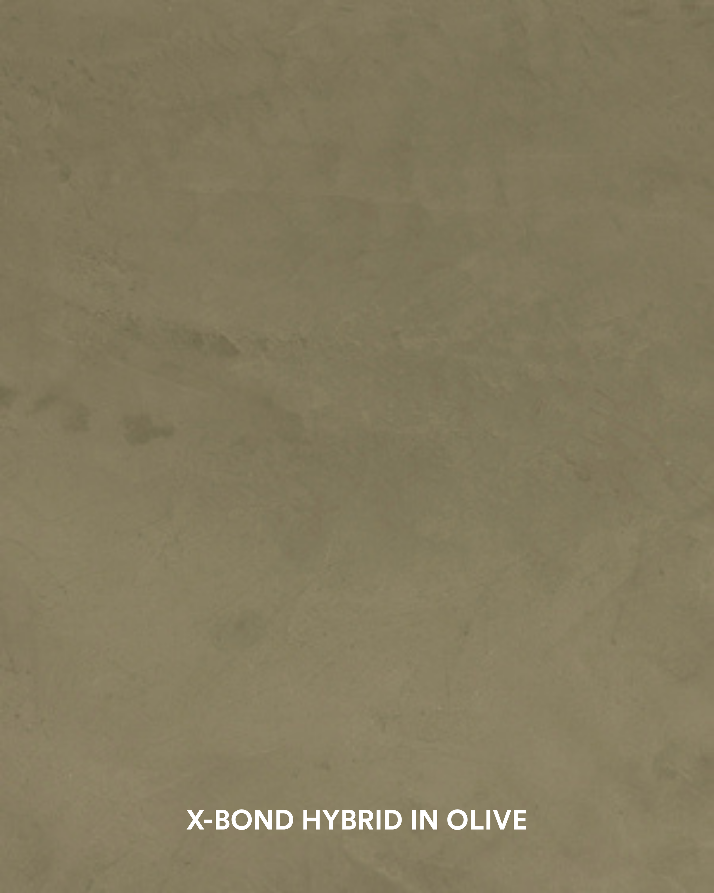
Get the look with X-Bond Hybrid in Olive.
2. Yellow & Silver
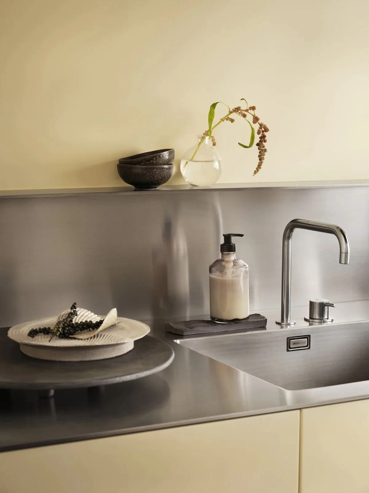
Yellow and silver bring together two very different design influences: softness, warmth and nostalgia meets sleek, industrial character.
While yellow is often paired with golden materials like timber and brass, introducing silver is a surprising twist, one that injects playful energy into the design. Stainless steel, chrome, and brushed aluminium bring a cool-toned contemporary edge to the palette, if you want to avoid the yellow coming across as overly sweet or vintage-inspired.
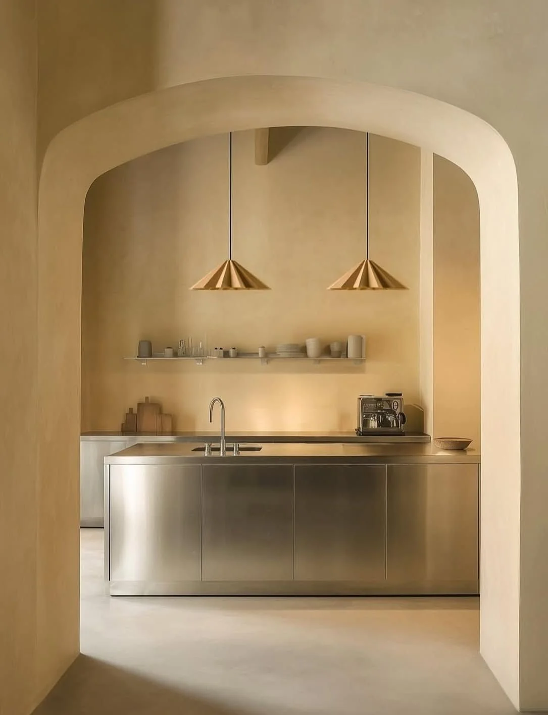
We're particularly drawn to this combination in kitchens, where creamy walls or buttery cabinet veneers can sit alongside stainless steel benchtops, splashbacks, and appliances.
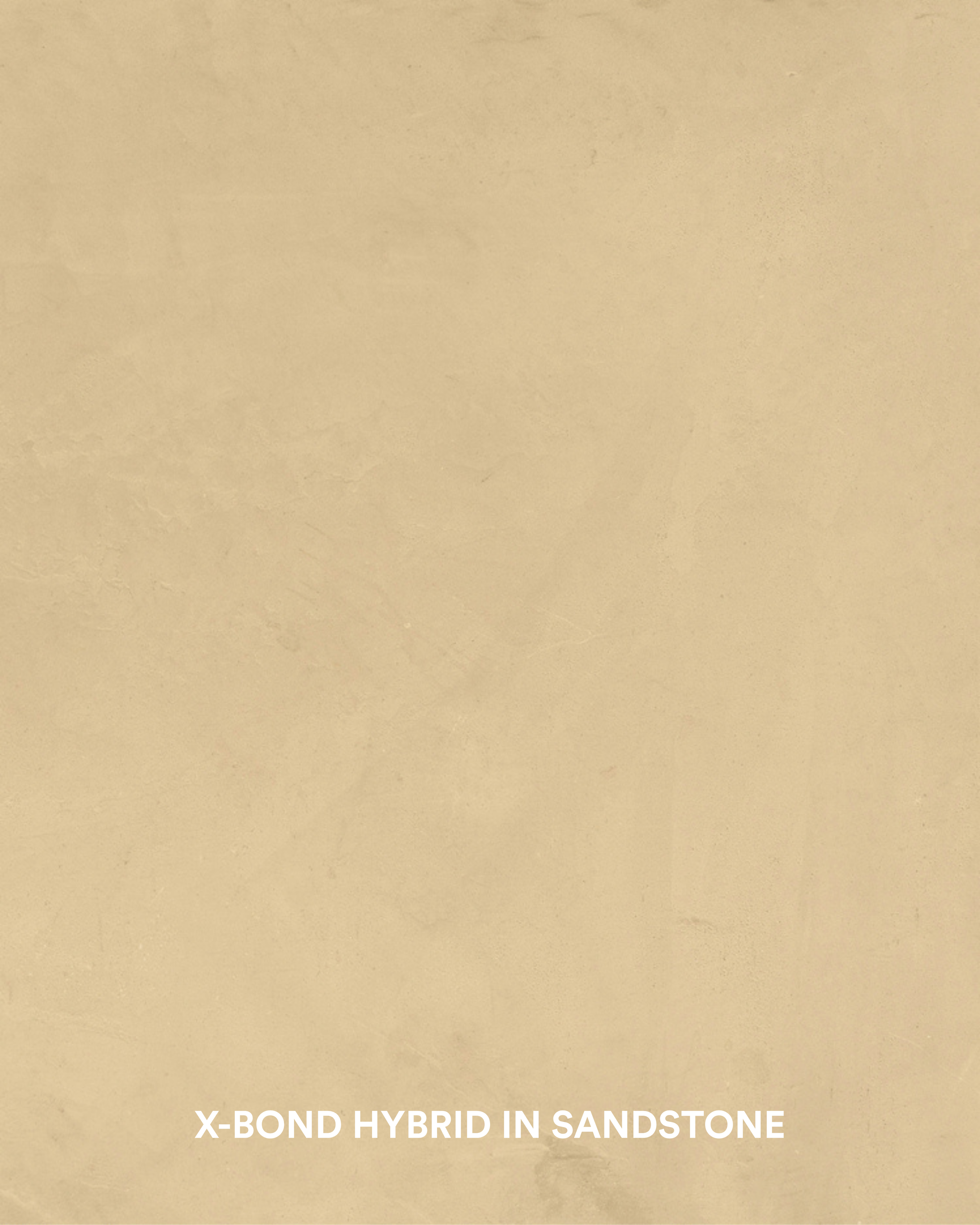
X-Bond Hybrid in Sandstone is a deeper shade with yellow undertones that can warm up a room without committing to bright, vibrant hues.
3. Pink & Terracotta
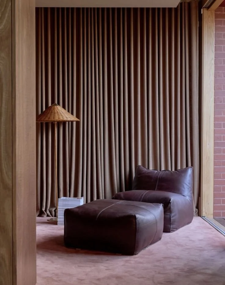
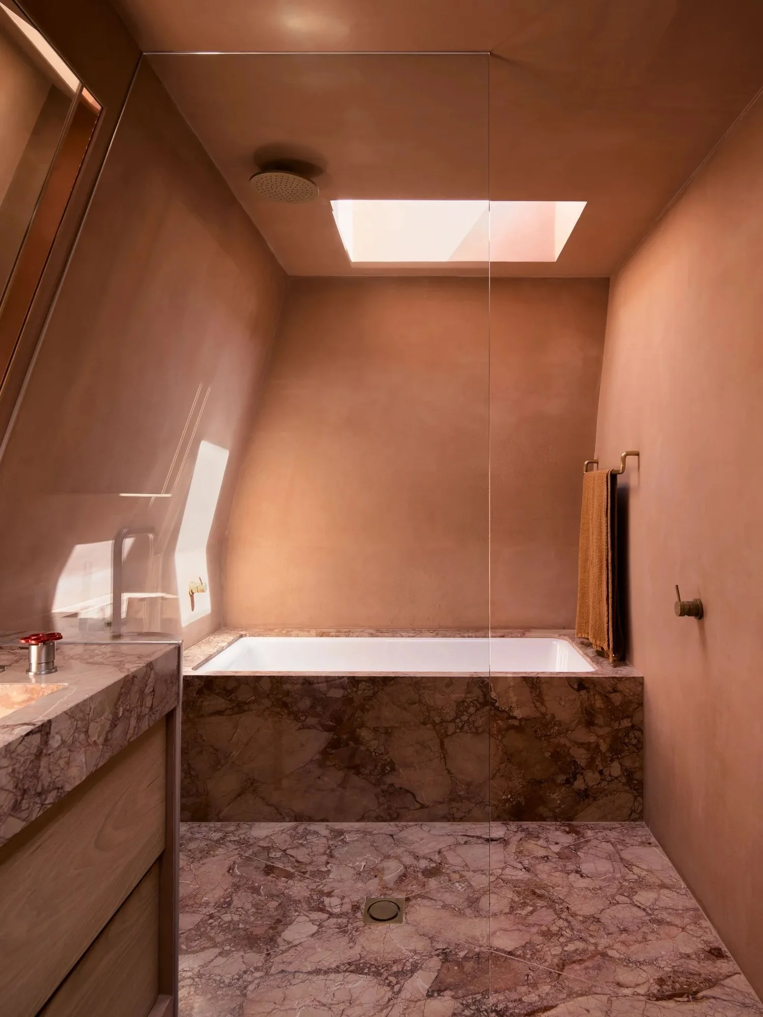
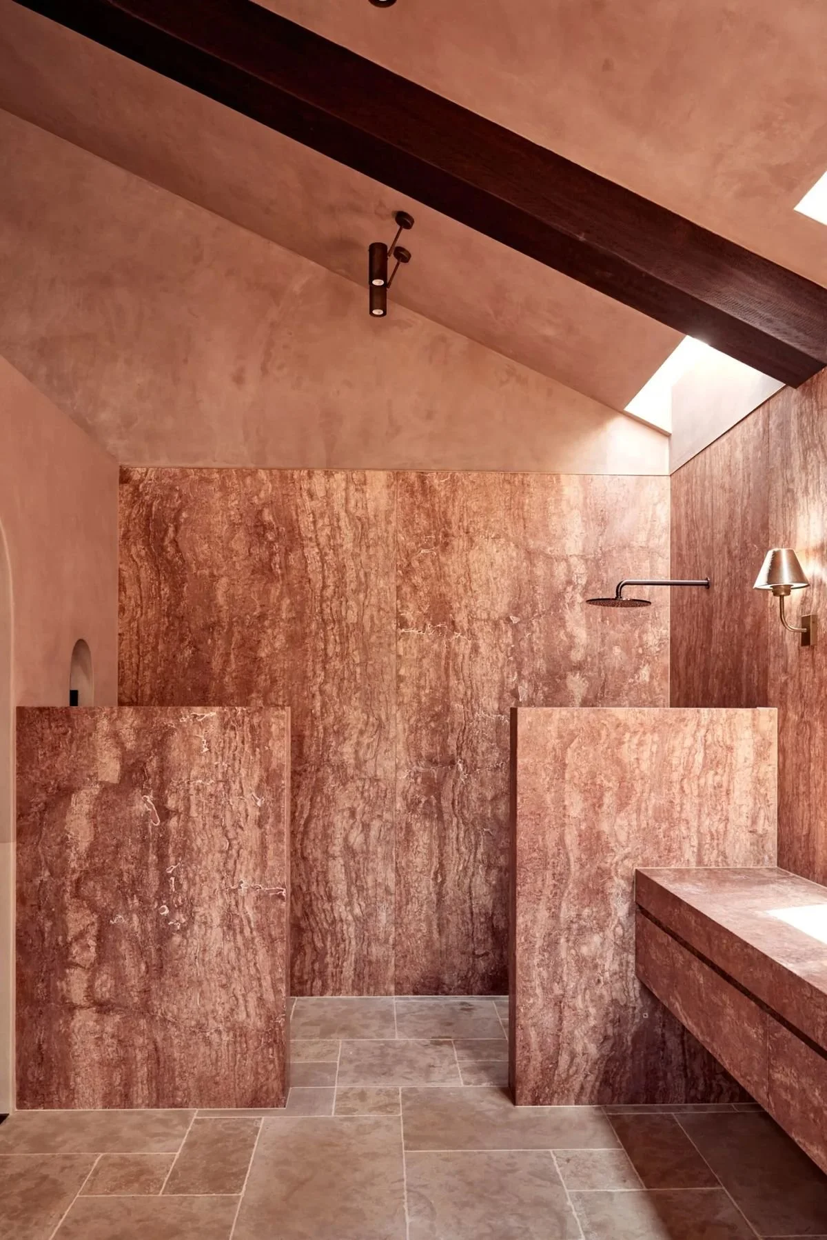
Where the other combinations on this list are all about contrast, pink and terracotta can sit at similar ends of the spectrum and are a great way to explore colour drenching. The trick is choosing shades with just enough variation to create depth, so you end up with a dimensional, layered interior — but one that doesn’t rely on busy elements to excite.
We love how past clients have paired rosy microcement finishes with statement pink stone in bathrooms, and likewise how artisanal tiles add another texture to the mix.
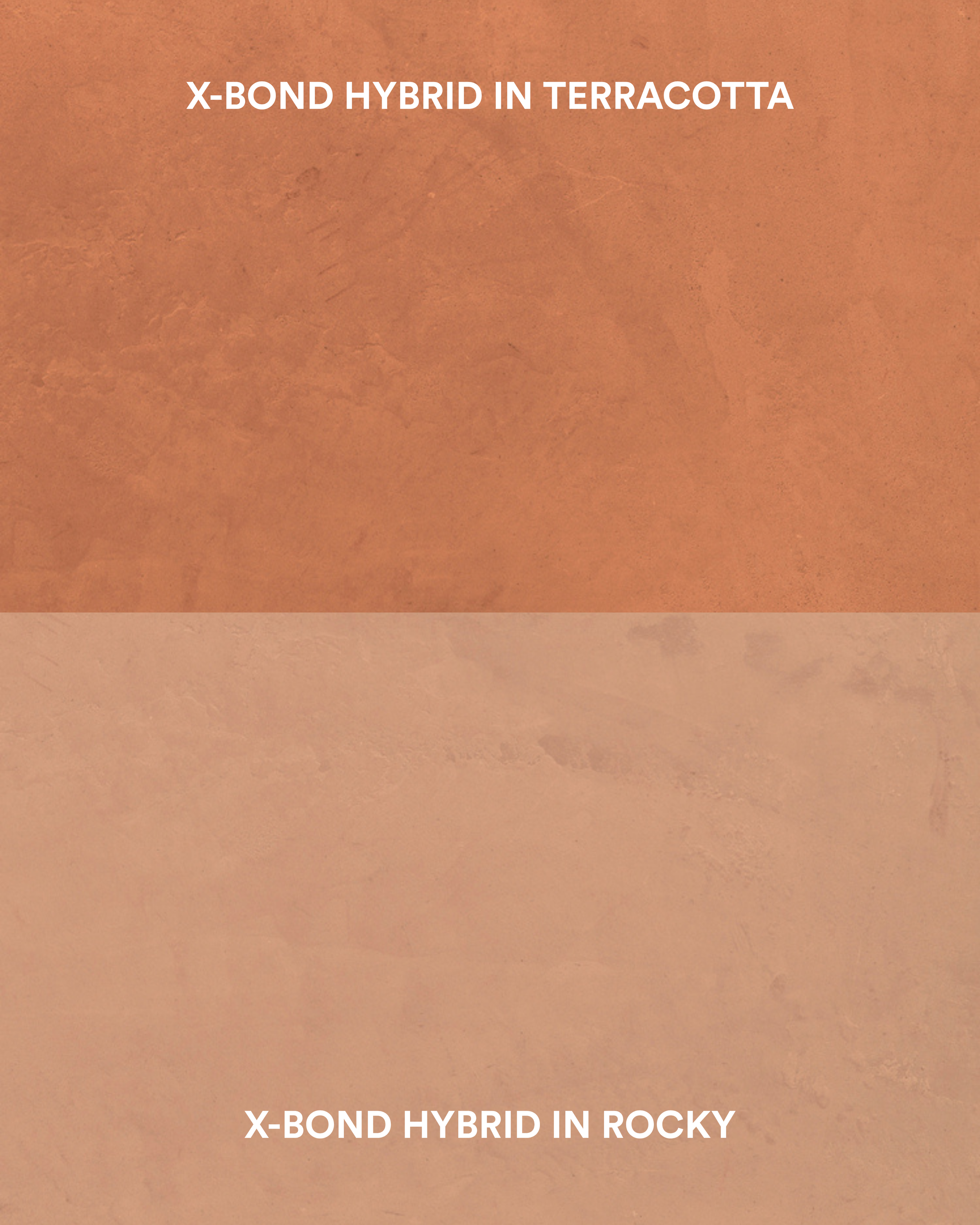
Get the terracotta look with X-Bond Hybrid in Rocky or Terracotta.
4. Powder Blue & Oxblood Red
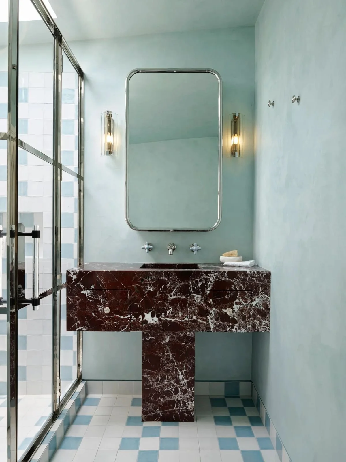
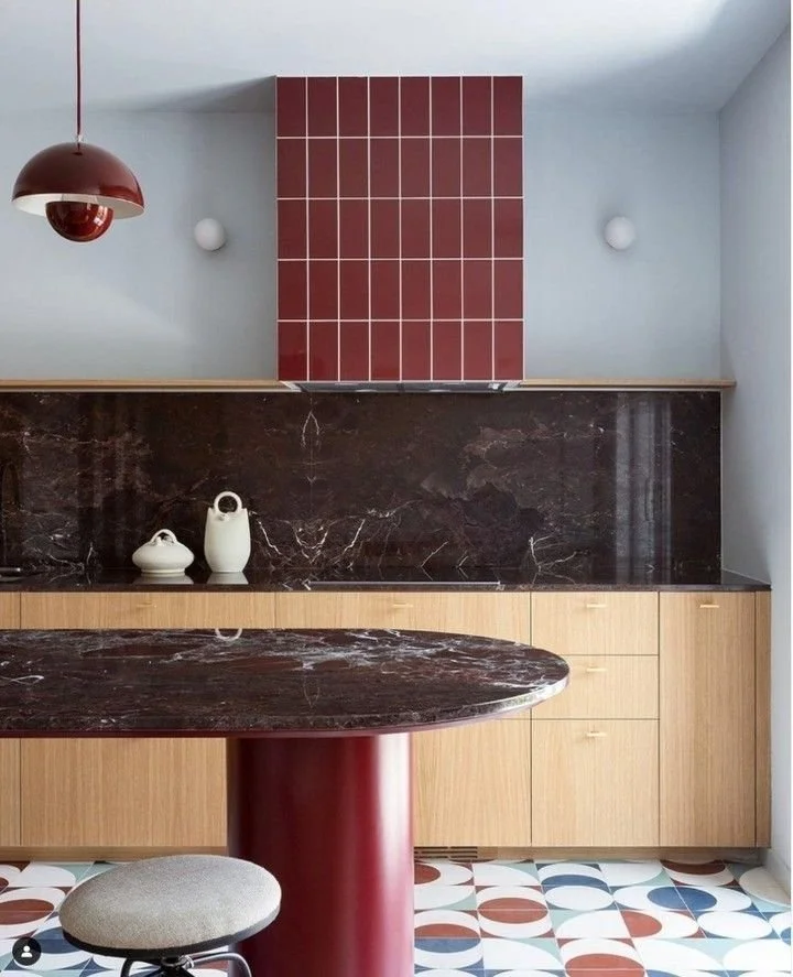
One of the bolder combinations on our list, powder blue and oxblood red create a striking contrast between cool and warm tones.
The softness of blue helps balance the intensity of oxblood, and likewise the red prevents the overall palette from feeling overly delicate. Used together, they can create a distinctly contemporary interior with a subtle retro influence.
We particularly like the idea of a muted blue wall surface alongside deep red furniture, lacquered cabinetry, or decorative stone. We find that the blue lends itself better to the larger surface finishes while oxblood is easier to style as furnishings or joinery.
For a more restrained interpretation, you can keep the larger surfaces neutral and introduce these colours through selected architectural details — think statement tables, cupboard veneers, artwork, rugs, bedding...
5. Brown & Purple
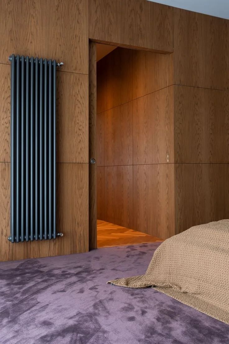
Brown and purple just make sense. The harmonious combination is created by a shared richness and depth, a natural tonal connection, while the contrast between brown’s earthy warmth and purple’s more expressive character keeps the palette interesting.
The beauty of this pairing is how much its character changes depending on the shade of purple — whether it’s warm or cool-toned. We’re particularly fond of darker shades like aubergine and plum, which lend themselves to moodier, more luxurious interiors with dark timber accents.
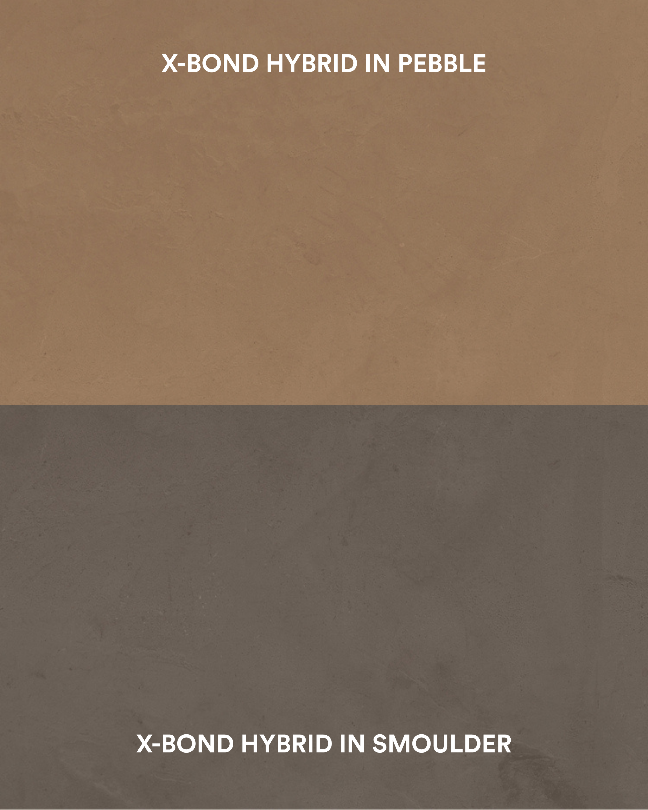
Get the brown look with X-Bond Hybrid in Pebble or Smoulder.